Nacre
Nacre
Skincare
Skincare
Skincare
2026
2026
2026
Self-Initiated
Self-Initiated
Self-Initiated
Brand Identity
Social Media
Logo Design
Art Direction
Packaging Design
Brand Identity
Social Media
Logo Design
Art Direction
Packaging Design
Brand Identity
Packaging Design
Art Direction
Logo Design
Social Media

Challenge
Challenge
The goal was to create a distinctive body care identity that could stand out in a highly saturated beauty market while feeling refined, contemporary, and recognizable. The visual system needed to work consistently across a full product range, packaging, print, and digital applications without losing its character.
The goal was to create a distinctive body care identity that could stand out in a highly saturated beauty market while feeling refined, contemporary, and recognizable. The visual system needed to work consistently across a full product range, packaging, print, and digital applications without losing its character.
The goal was to create a distinctive body care identity that could stand out in a highly saturated beauty market while feeling refined, contemporary, and recognizable. The visual system needed to work consistently across a full product range, packaging, print, and digital applications without losing its character.
Solution
Solution
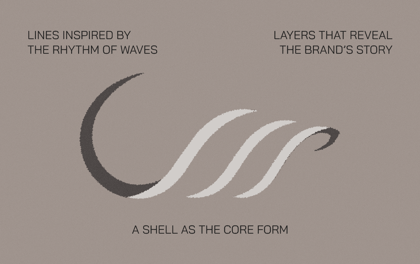
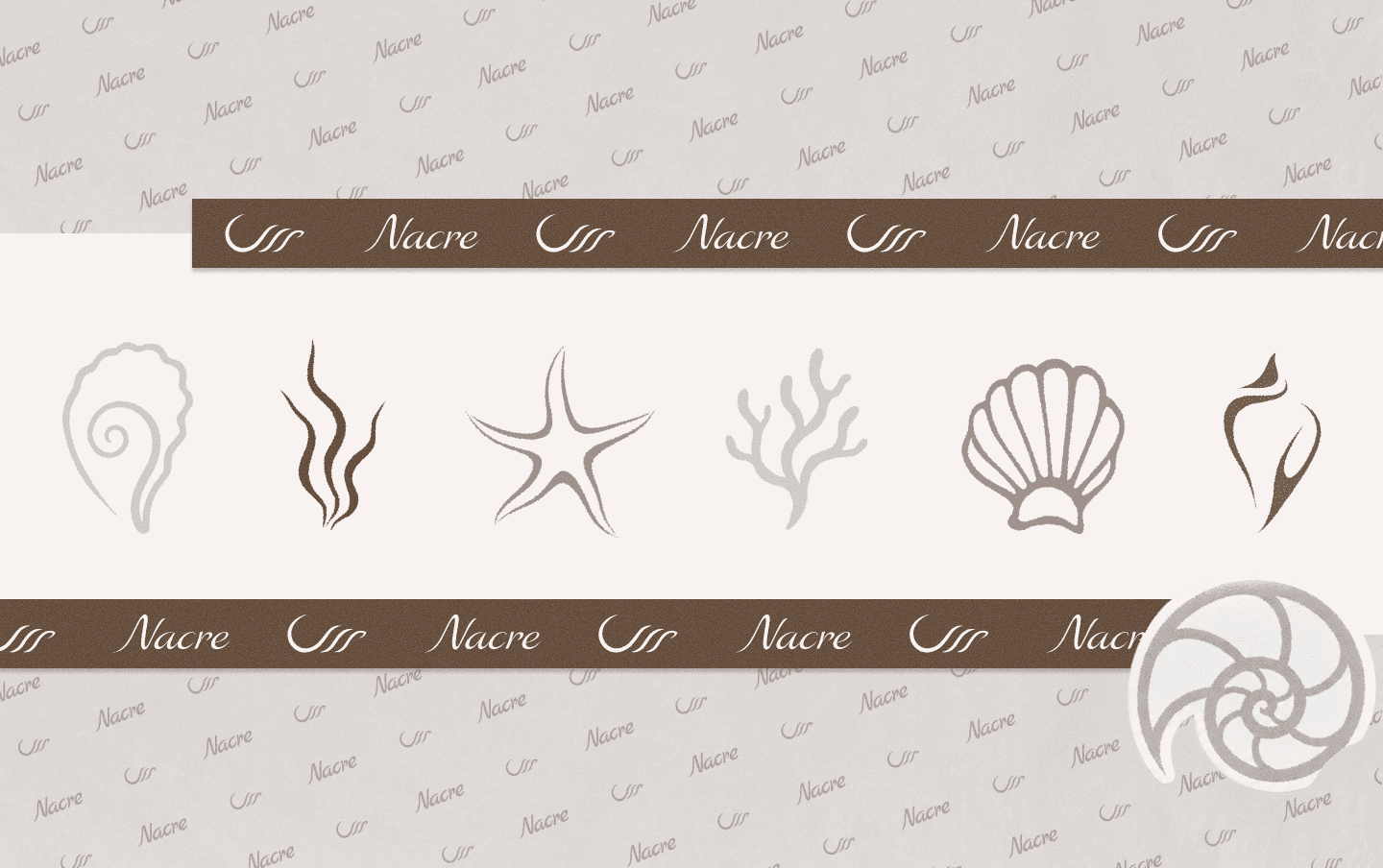
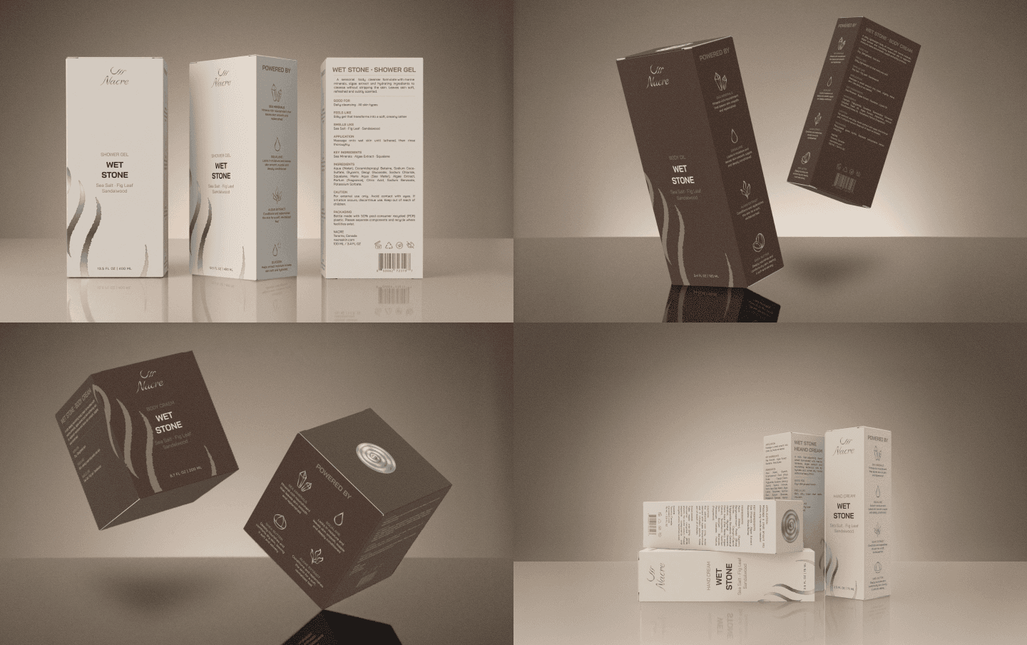
A cohesive identity system was built around a balance of expressive and minimal design. Distinctive typography, organic graphic elements, a restrained color palette, and a consistent packaging structure create strong recognition across the collection. The system was extended beyond packaging into print and social media, allowing NACRE to maintain the same visual character across every brand touchpoint.
A cohesive identity system was built around a balance of expressive and minimal design. Distinctive typography, organic graphic elements, a restrained color palette, and a consistent packaging structure create strong recognition across the collection. The system was extended beyond packaging into print and social media, allowing NACRE to maintain the same visual character across every brand touchpoint.
A cohesive identity system was built around a balance of expressive and minimal design. Distinctive typography, organic graphic elements, a restrained color palette, and a consistent packaging structure create strong recognition across the collection. The system was extended beyond packaging into print and social media, allowing NACRE to maintain the same visual character across every brand touchpoint.